Impact
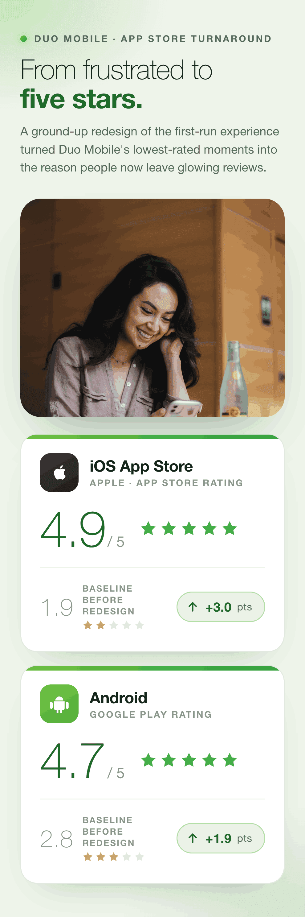
⚡️ App store rating from 1.9 → 4.9 on iOS
⚡️ Google store rating from 2.8 → 4.3 on Android
🌎 26M+ Users and 40+ languages
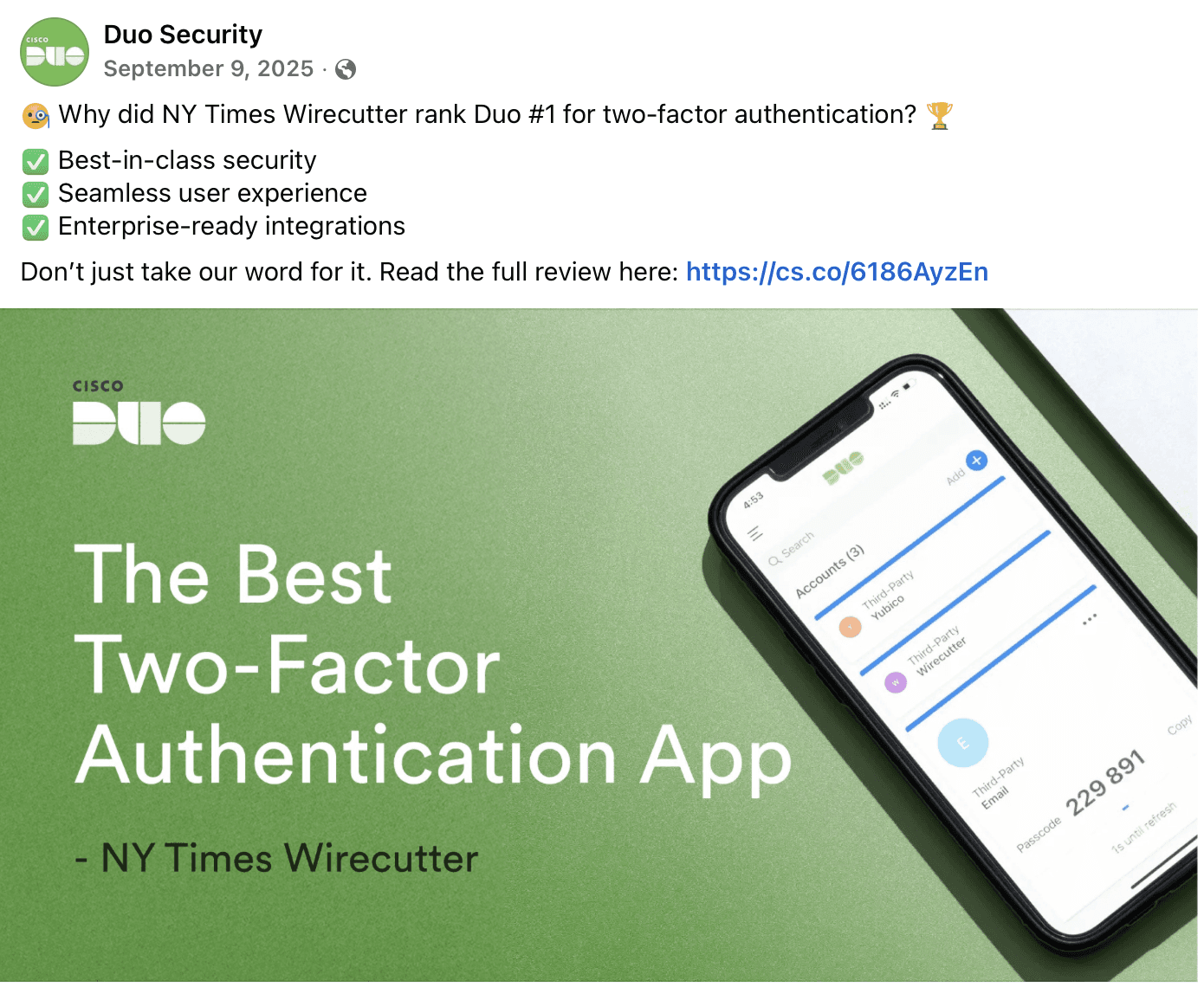
🥇 #1 rated MFA app by NYT Wirecutter (2024-2025)
The Vision: Rebuilding a Buckling Foundation
When I joined the Duo Mobile team in 2019, the application had been evolving organically since 2010.
Over that decade, a massive accumulation of incremental decisions had led to an information architecture that was actively buckling under its own weight. We frequently asked ourselves, "Where does this new feature go?" only to run into the exact same answer: we had already filled every logical space. The app was functional, but the underlying structure was entirely tapped out.
The stakes were incredibly high, as the application served over millions users who relied on it for daily
multi-factor authentication across iOS and Android. Critical tools that customers and sales engineering depended on, specifically those needed to troubleshoot complex problems, were essentially hidden because there was nowhere else to put them. It became clear that we couldn't keep patching the experience with superficial updates; we needed to rethink how the application was organized from the ground up.
The Vision: Rebuilding a Buckling Foundation
When I joined the Duo Mobile team in 2019, the application had been evolving organically since 2010.
Over that decade, a massive accumulation of incremental decisions had led to an information architecture that was actively buckling under its own weight. We frequently asked ourselves, "Where does this new feature go?" only to run into the exact same answer: we had already filled every logical space. The app was functional, but the underlying structure was entirely tapped out.
The stakes were incredibly high, as the application served over millions users who relied on it for daily
multi-factor authentication across iOS and Android. Critical tools that customers and sales engineering depended on, specifically those needed to troubleshoot complex problems, were essentially hidden because there was nowhere else to put them. It became clear that we couldn't keep patching the experience with superficial updates; we needed to rethink how the application was organized from the ground up.
The Vision: Rebuilding a Buckling Foundation
When I joined the Duo Mobile team in 2019, the application had been evolving organically since 2010. Over that decade, a massive accumulation of incremental decisions had led to an information architecture that was actively buckling under its own weight. We frequently asked ourselves, "Where does this new feature go?" only to run into the exact same answer: we had already filled every logical space. The app was functional, but the underlying structure was entirely tapped out.
The stakes were incredibly high, as the application served over millions users who relied on it for daily multi-factor authentication across iOS and Android. Critical tools that customers and sales engineering depended on, specifically those needed to troubleshoot complex problems, were essentially hidden because there was nowhere else to put them. It became clear that we couldn't keep patching the experience with superficial updates; we needed to rethink how the application was organized from the ground up.
Legacy app design compared to the redesigned app
Legacy app compared to the redesigned app
Legacy app compared to the redesigned app
Impact
⚡️ App score rating from 1.9 → 4.9 on iOS
⚡️ Google score rating from 2.8 → 4.3 on Android
🌎 26M+ Users and 40+ languages
This project wasn't just a visual refresh; it was a zero-to-one reimagining of a foundational security platform. As the sole product designer supporting two separate engineering teams, my mandate was to architect a scalable solution that could support future growth without alienating our massive existing user base. The vision was to transform a dated, cluttered utility into a modern, flexible platform that felt native, accessible, and trustworthy on every device globally.
Discovery and Ambiguity:
The Enrollment Research Foundation
To manage the uncertainty of a complete platform overhaul, we based our decisions on user research.
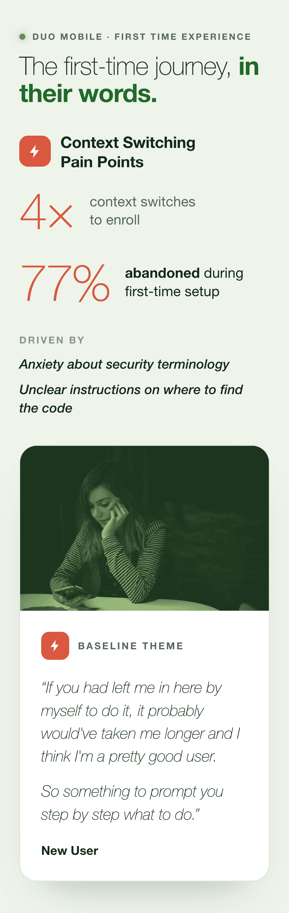
Starting in late 2019, I worked with a research partner to conduct 4 months of enrollment studies. We ran onsite sessions to observe first-time Duo users setting up the app, documenting their friction points and successes. This work showed that a user's first experience with the app determines whether they will trust it.
Discovery and Ambiguity:
The Enrollment Research Foundation
To manage the uncertainty of a complete platform overhaul, we based our decisions on user research.
Starting in late 2019, I worked with a research partner to conduct 4 months of enrollment studies. We ran onsite sessions to observe first-time Duo users setting up the app, documenting their friction points and successes. This work showed that a user's first experience with the app determines whether they will trust it.
Discovery and Ambiguity:
The Enrollment Research Foundation
To manage the uncertainty of a complete platform overhaul, we based our decisions on user research.
Starting in late 2019, I worked with a research partner to conduct 4 months of enrollment studies. We ran onsite sessions to observe first-time Duo users setting up the app, documenting their friction points and successes. This work showed that a user's first experience with the app determines whether they will trust it.
We also tested improvements across two research rounds in February and April 2020. During these sessions, we realized the default experience needed to focus on the 83% of users who manage only one account.
This research phase became the undeniable north star for the broader redesign effort. It shifted our perspective from merely organizing features to meticulously crafting a journey of trust. We knew that if the initial onboarding flow felt confusing or broken, users would carry that anxiety into every subsequent authentication request, fundamentally undermining the purpose of a security application.
Finding Signal: The Passcode User Epiphany
Redesigning an application for millions of users meant balancing fiercely competing priorities across Product, Engineering, Support, and Accessibility. Early in the project, we hit a critical conflict when Engineering pushed back hard on a proposed 'wallet style' card design for users managing multiple accounts. On the surface, it looked like a standard technical disagreement. However, digging deeper revealed that we had validated the design with the completely wrong audience: people with only 2-3 accounts.
Engineering was absolutely right to push back, which sparked a rapid research sprint to understand our actual power users. We discovered an entirely new persona we had been designing blind to: the frequent passcode users, who made up 17% of our total user base. These individuals were managing anywhere from 20 to 50 accounts and authenticating roughly 28 times a day. For them, the app wasn't just an occasional security tool; it was pure muscle memory and demanded absolute speed.
Our previous single-card layout was an active obstacle for this group, requiring excessive scrolling and extra clicks for what should be a two-second task. In fact, their ease of use score in the early beta was a a low 2.6 out from 10 users. This breakthrough insight changed everything about how we organized information, forcing us to prioritize speed over visual consistency for this specific cohort. We realized that behavior, rather than mere demographics or account count, was the true signal for defining our users.
I partnered with the accessibility engineer ensuring it wasn't bolted on at the end but woven into the fabric of the redesign. I brought our accessibility engineer into our weekly meetings to provide real-time feedback. This proactive approach fundamentally changed how we sequenced information on screen, managed color contrast, and defined touch targets. We constantly asked ourselves how the experience felt for someone with low vision or someone relying on a screen reader.
First Principles Design: Defining the North Star
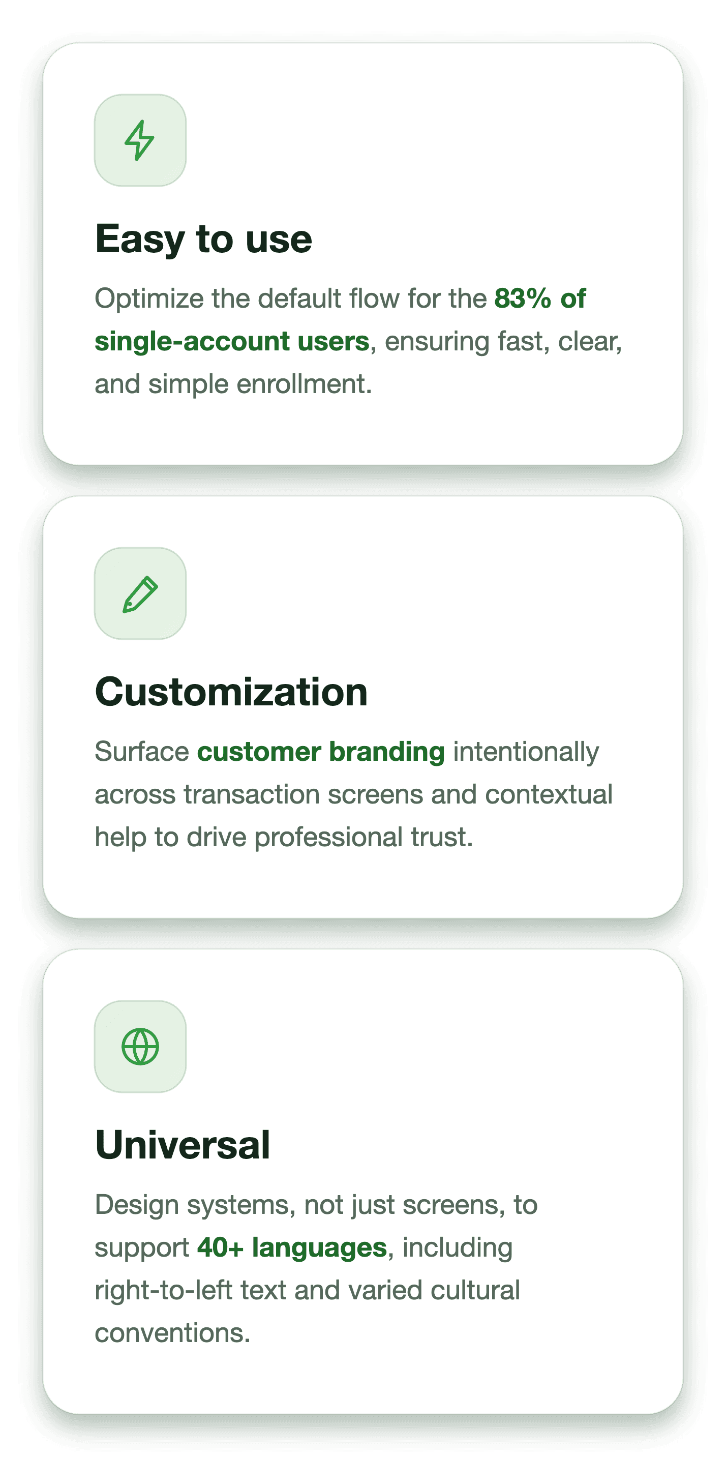
Before laying down a single pixel of the final interface, we had to be ruthlessly clear about what we were optimizing for. I established three core goals that became our north star for every subsequent design decision. First was 'Easy to Use' since 83% of users have just one account, the default experience needed to be simple, fast, and clear, while still possessing the elasticity to grow for power users without becoming overwhelming.
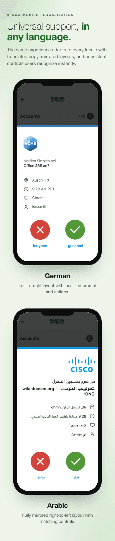
The second goal was 'Customization'. Customers were downloading Duo for one primary reason: to protect their own brand. We needed a cohesive brand experience that showed up everywhere, ensuring our design surfaced customer branding on the transaction screen and aligned with their companion desktop product. The third goal was 'Universal', the app needed to support over 40 languages. What we built in English had to work flawlessly in Japanese, Arabic, German, and Spanish, requiring global thinking from the start.
First Principles Design: Defining the North Star
Before laying down a single pixel of the final interface, we had to be ruthlessly clear about what we were optimizing for. I established three core goals that became our north star for every subsequent design decision. First was 'Easy to Use' since 83% of users have just one account, the default experience needed to be simple, fast, and clear, while still possessing the elasticity to grow for power users without becoming overwhelming.
The second goal was 'Customization'. Customers were downloading Duo for one primary reason: to protect their own brand.
We needed a cohesive brand experience that showed up everywhere, ensuring our design surfaced customer branding on the transaction screen and aligned with their companion desktop product. The third goal was 'Universal', the app needed to support over 40 languages. What we built in English had to work flawlessly in Japanese, Arabic, German, and Spanish, requiring global thinking from the start.
First Principles Design: Defining the North Star
Before laying down a single pixel of the final interface, we had to be ruthlessly clear about what we were optimizing for. I established three core goals that became our north star for every subsequent design decision. First was 'Easy to Use' since 83% of users have just one account, the default experience needed to be simple, fast, and clear, while still possessing the elasticity to grow for power users without becoming overwhelming.
The second goal was 'Customization'. Customers were downloading Duo for one primary reason: to protect their own brand. We needed a cohesive brand experience that showed up everywhere, ensuring our design surfaced customer branding on the transaction screen and aligned with their companion desktop product. The third goal was 'Universal', the app needed to support over 40 languages. What we built in English had to work flawlessly in Japanese, Arabic, German, and Spanish, requiring global thinking from the start.
I partnered with the accessibility engineer ensuring it wasn't bolted on at the end but woven into the fabric of the redesign. I brought our accessibility engineer into our weekly meetings to provide real-time feedback. This proactive approach fundamentally changed how we sequenced information on screen, managed color contrast, and defined touch targets. We constantly asked ourselves how the experience felt for someone with low vision or someone relying on a screen reader.
Building and Testing: March Madness and the
Three Betas
While the backend engineering team worked to support the new architecture, we kicked off an intense design sprint in March 2021 that we affectionately dubbed 'March Madness'. The pace was relentless, with screens, usability testing, and iterations all happening in parallel across both iOS and Android platforms. To manage this as a solo designer supporting 10 engineers, I structured the rollout into three distinct, strategic beta phases.
Beta 1 focused on the moments that mattered most for a first-time user: the onboarding flow, permissions, and the transaction view. Beta 2 went much deeper into recovery and resilience, tackling features like Instant Restore and Push Troubleshooting. This phase addressed one of the most overlooked problems in the product: the staggering 65% of users who had no recovery path set up and didn't even know it. Finally, Beta 3 refined the everyday experience, polishing the navigation menu, settings, and account editing surfaces.
Running alongside all three betas was the creation of a robust, reusable component library. We built text styles, buttons, modals, error states, and dark mode adaptations from scratch. This foundational work rarely gets the spotlight in case studies, but it was the engine that made our scale possible. It drastically compressed design-to-build time and allowed engineers to prototype faster, making consistency automatic rather than aspirational.
Scaling the Team: From Chaos to Documented Decisions
Before the redesign, our operating model was scattered. Decisions lived in Slack threads or people's heads, iOS and Android were designed and reviewed separately, and visual debt compounded quarterly. The app used hundreds of colors simply because developers guessed or designers mistyped hex codes. There was no shared understanding of why things were designed a certain way, leading to frequent churn and frustration.
I knew I had to create a working pattern that would keep us moving fast while keeping everyone informed. I established two weekly meetings, for the entire mobile team, that became the heartbeat of the project. These weren't just status updates; we brought in research, debated trade-offs, and surfaced questions before they became engineering blockers. We moved from intuition to data, making decisions traceable through documented logs and Jira grooming sessions.
The most transformative change was implementing side-by-side design reviews as part of our 'definition of done'. A developer would collect screenshots and videos from both platforms, present them together, and we'd catch inconsistencies in copy, interaction flow, and bugs in real time. This meant I was constantly looking at every screen and asking: 'Is this experience native to the platform, or does it feel adapted from somewhere else?' It ensured we shipped one cohesive product, not two platforms that happened to share a name.
Launch and Validation: Shipping a Global Platform
By July 2021, we were ready to launch. I had designed every single screen, layout, interaction, and state in that redesign without any additional design help until the final month. The engineering team had completely rebuilt the brittle legacy codebase, allowing us to implement features and see how people used them without the constant fear of breaking the app. Every release no longer felt like a massive risk.
We successfully shipped the complete redesign to our 12 million users. The timing was incredibly personal, as I shipped this massive zero-to-one platform overhaul at exactly 40 weeks pregnant. I kept designing right up until I left for maternity leave. When people asked if I wanted to step back before the ship, I declined. This was my work, and I was determined to see it through to the end.
Launch and Validation: Shipping a Global Platform
By July 2021, we were ready to launch. I had designed every single screen, layout, interaction, and state in that redesign without any additional design help until the final month. The engineering team had completely rebuilt the brittle legacy codebase, allowing us to implement features and see how people used them without the constant fear of breaking the app. Every release no longer felt like a massive risk.
We successfully shipped the complete redesign to our 11 million users. The timing was incredibly personal, as I shipped this massive zero-to-one platform overhaul at exactly 40 weeks pregnant. I kept designing right up until I left for maternity leave. When people asked if I wanted to step back before the ship, I declined. This was my work, and I was determined to see it through to the end.
The internal validation was just as rewarding as the external launch. Over time, I watched a profound shift in team culture. Engineers started actively defending design directions in company-wide demos using our research data. They weren't just executing someone else's vision anymore; they deeply understood the 'why' behind every decision. That shared ownership was the moment I knew our alignment was truly real.
Traction and Growth: Metrics that Prove It Worked
The impact of the redesign was immediate and undeniable. App store ratings skyrocketed, moving from 1.9 to 4.9 on iOS, and from 2.8 to 4.7 on Android. But the numbers that mattered more to me were the ones proving we had built a platform that could actually scale. We successfully served first-time users alongside power users authenticating 28 times a day, across more than 40 countries, with accessibility woven through every single screen.
Internally, our velocity and morale saw a massive boost. The new operating model reduced our decision-making process from 5 cumbersome steps down to just 3: a question comes up, we review the data, and we make an informed decision. By implementing Google Analytics with funnel tracking across the app, we moved from guessing to seeing. We could pinpoint exactly where users were dropping off during enrollment.
My question at the start of every design sprint shifted to, 'What does the data tell us?' This analytics-driven approach, combined with our new component library and side-by-side review framework, established long-term organizational standards that outlasted my time on the project. We proved that a team could ship high-quality work incredibly fast when supported by the right infrastructure.
What I Learned: Infrastructure, Behavior, and Constraints
This massive zero-to-one effort taught me that designing at scale is about far more than pushing beautiful screens. It is fundamentally about creating working patterns that allow a cross-functional team to move fast together. I learned that solo designers on massive projects cannot just rely on their design skills; they must proactively build their own infrastructure for collaboration, weaving in consistent feedback loops and accessibility from day one.
The project also reinforced that understanding your users deeply, who they are demographically, and how they actually behave. Discovering our frequent passcode users taught me that behavioral signals matter significantly more than arbitrary account counts when defining a power user.
Finally, I learned that you can do incredibly meaningful work even when the conditions aren't ideal. Being the sole designer for two platform teams and ten engineers while navigating a full pregnancy was daunting. However, shipping this redesign the same month I gave birth was a full-circle moment;
two creations that I poured absolutely everything into.
What I Learned: Infrastructure, Behavior, and Constraints
This massive zero-to-one effort taught me that designing at scale is about far more than pushing beautiful screens. It is fundamentally about creating working patterns that allow a cross-functional team to move fast together. I learned that solo designers on massive projects cannot just rely on their design skills; they must proactively build their own infrastructure for collaboration, weaving in consistent feedback loops and accessibility from day one.
The project also reinforced that understanding your users deeply, not just who they are demographically, but how they actually behave, changes everything. Discovering our frequent passcode users taught me that behavioral signals matter significantly more than arbitrary account counts when defining a power user.
Finally, I learned that you can do incredibly meaningful work even when the conditions aren't ideal. Being the sole designer for two platform teams and ten engineers while navigating a full pregnancy was daunting. However, constraints aren't excuses, they are just the reality of the work. Shipping this redesign the same month I gave birth was a full-circle moment; two creations that I poured absolutely everything into.
What I Learned: Infrastructure, Behavior, and Constraints
This massive zero-to-one effort taught me that designing at scale is about far more than pushing beautiful screens. It is fundamentally about creating working patterns that allow a cross-functional team to move fast together. I learned that solo designers on massive projects cannot just rely on their design skills; they must proactively build their own infrastructure for collaboration, weaving in consistent feedback loops and accessibility from day one.
The project also reinforced that understanding your users deeply, who they are demographically, and how they actually behave. Discovering our frequent passcode users taught me that behavioral signals matter significantly more than arbitrary account counts when defining a power user.
Finally, I learned that you can do incredibly meaningful work even when the conditions aren't ideal. Being the sole designer for two platform teams and ten engineers while navigating a full pregnancy was daunting. However, shipping this redesign the same month I gave birth was a full-circle moment; two creations that I poured absolutely everything into.